Color Palette Chaos
February 28, 2019
Not to sound dramatic, but choosing a color palette has recently become my personal Hell. Why? Because we live in a beautiful, colorful world with so much inspiration that you could probably spend days and weeks figuring out which scheme to go with. And sometimes you make up your own scheme, which opens up a whole new world of ideas. There is no perfect science to choosing a color palette, it has to coincide with what is inspiring you at that time, or what you find aesthetically pleasing. Sometimes it requires a bit of research, especially if you want to target a specific color scheme (e.g., a flower, a season, a nebula in outer space).
Arguably, a mandala color scheme based on something that has its own specific color palette does make the job easier, but that does not mean that you HAVE to follow a set structure of colors. You can play around with the shades and mix paints around to still achieve a variety within the pre-determined palette.
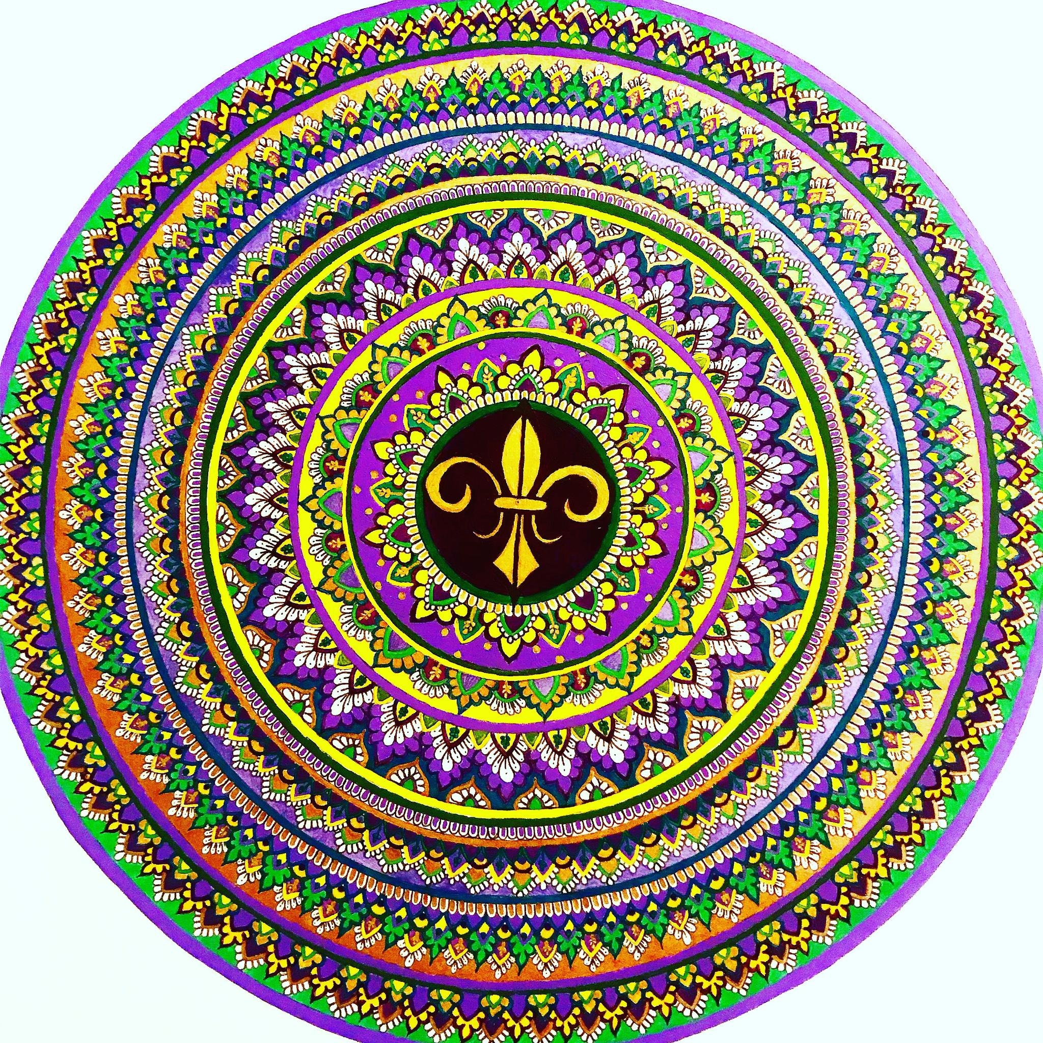
When I painted "Mardi Gras", I went through my entire assortment of paints to find the purple, green, and yellow that the parade's color palette requires. Afterwards, however, I took a trip to my local art store and picked up different shades of those same colors, as well as various shades of gold. I accented them with their metallic variants, I used liquid gold for the Fleur de Lis in the center, and a dark burgundy to surround it rather than purple. I didn't shy away from bright, neon green and light, metallic purple. As long as you can see it working together, you can always have variety within a set color scheme and still achieve the desired result.
Still on the topic of set color schemes, you can also create your own set color scheme. For example, you can create a mandala based on a specific color or a certain palette that appeals to you, and that actually might allow for even more freedom in varying the colors within the palette that you set. If you decide one day that you want to paint your mandala all red or all purple or green or yellow, you can still add in different accents with different colors or varied shades to reach the desired effect. Remember, when you set a palette, the objective is to reach your desired effect, so even if you go crazy with varying shades, as long as you arrive to the look of your piece that you wanted then you're on the right track!
It's all about your preference!
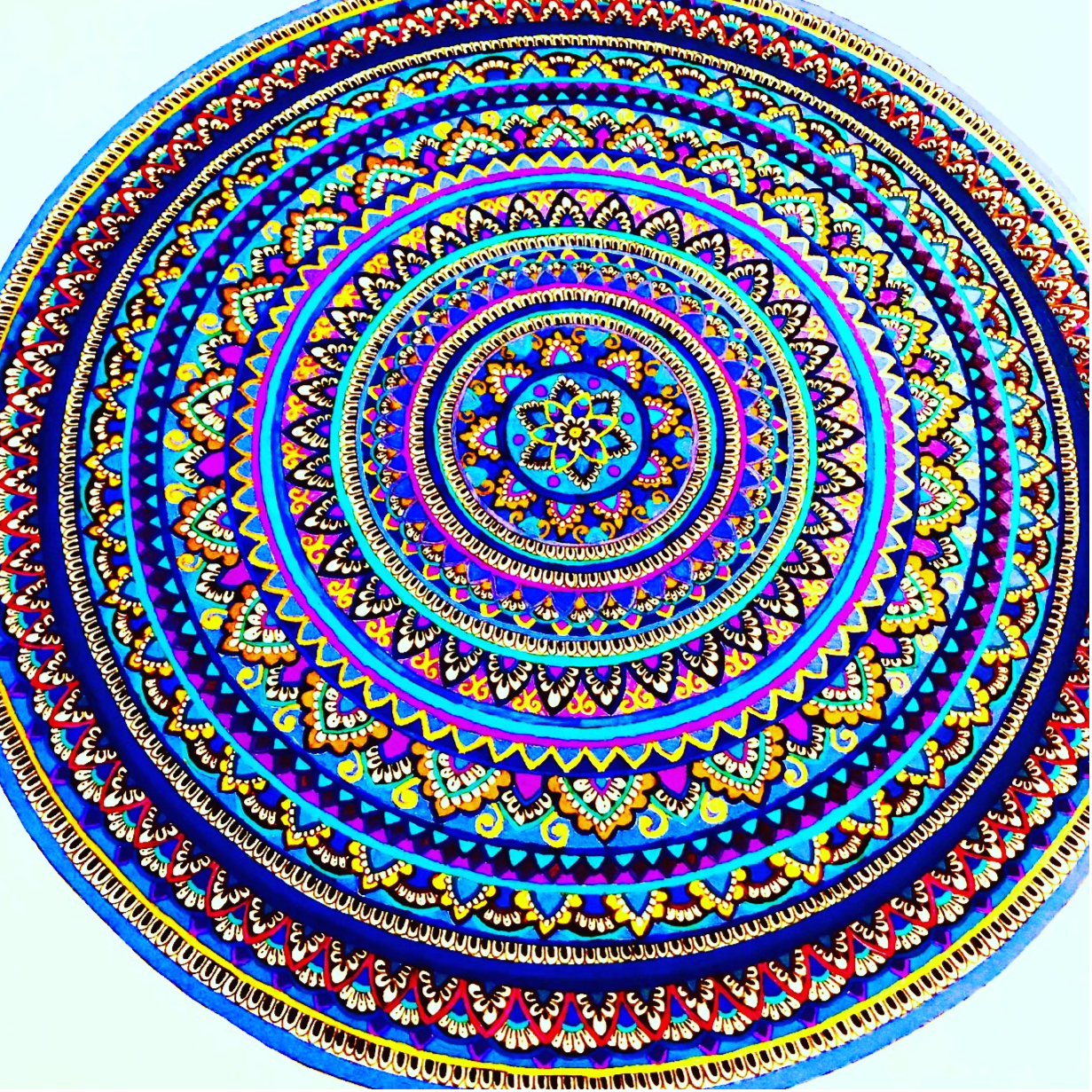
"Blue Crush", to the left, was meant to be a mandala that was strictly blue and nothing else. As I mentioned before, blue is my favorite color, and I wanted to paint a mandala to reflect that. But sometimes something as simple as mixing paints can make you realize that you can have other colors outside the one you wanted and still attain the desired effect. The mandala remained as blue as possible, but by playing with colors such as gold, pink, purple, teal, and lavender, I managed to add some variety even though all I wanted for the mandala was blue. That's just an example of how you can really and truly stray from your desired palette if you wish. Even if you make a mistake and add in a color that wasn't planned for, you can still make it work in your own way. The whole idea is to not panic and remember that there is no written law about painting mandalas. You can play off of your mistakes or your experiments as much as you want, that's one of the many beauties of this art form!
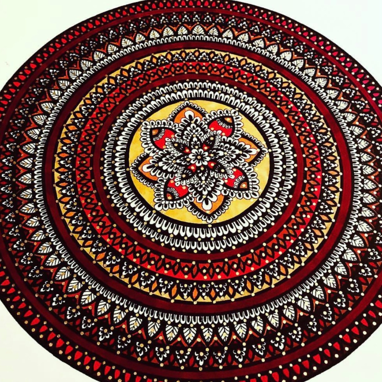
With "Nagada Sang Dhol", to the right, I wanted to make a mandala that had a red theme to it, but I specified it even more. I was inspired by Bollywood actress, Deepika Padukone's, lehenga choli (a traditional Indian dress often wore during the Navarti Festival during the Garba dances) in the song "Nagada Sang Dhol" from the popular Bollywood film, "Goliyon ki Raasleela: Ram Leela". In the song, Deepika Padukone is wearing a red lehenga choli with gold accents, and that inspired the red palette that I went with in the mandala. I kept the gold accents but also added yellow and bright orange as well. For this mandala, the coloring was done using markers and, instead of painting the outline, I colored the lining in with black ink to make her makeup in the song. So even in this mandala I had a set palette with the color red and inspired by a specific dress. I couldn't mix paints but I managed to still add in a variety of red shades and other accent colors. So even if you don't use paints, there are still ways you can add variety to your piece within the color palette that you set for yourself.
When it comes to color schemes that you choose at random, there is a lot more freedom because you aren't following a set palette. However, the choices can be overwhelming sometimes and when you make a habit of choosing colors at random you find that you start to pick the same tones every time. When I first started drawing, I wanted to have freedom in the colors that I chose, so I didn't choose a set palette but instead tried to find random colors or schemes that inspired me and then mix them together. Then I started researching around to see how other artists made certain colors work and started shuffling random colors around to see how that would work.
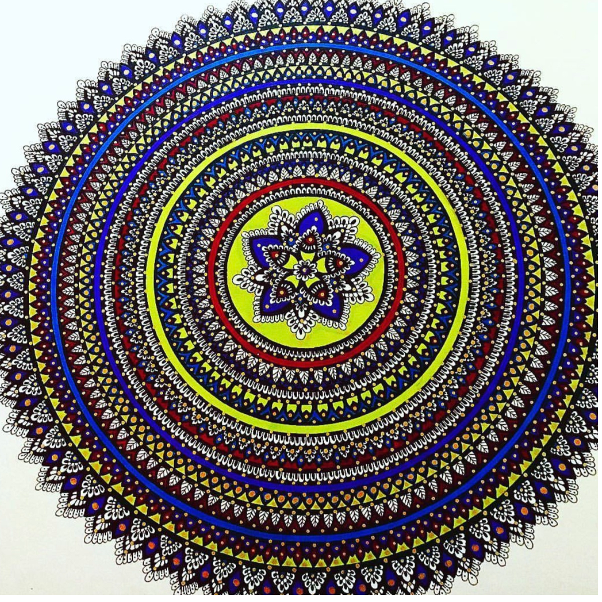
"Kaleidoscope" is the first 14 X 17 mandala that I drew, and with one of this size, I was getting overwhelmed with how I would go about coloring it in. This was also before I started working with acrylics. I remember digging through my marker collection and only coming up with colors that I had used before. Not wanting to be repetitive, I asked my sister for advice on how to color it and she suggested bright green, purple, and red, all colors that I had used before but not much. So I went with it and threw in a little blue, eventually coming up with this design that I actually was very proud of. But it was a struggle to get out of the rut of what I was used to doing, and that is why I advise anyone that asks to balance set color schemes with randomly chosen ones.
Like I said, choosing colors at random was my starting point. Eventually, however, I began to get very repetitive with my color schemes and my mandala almost always started to look the same, so I began to incorporate set schemes into my projects. I looked into colors inspired by the seasons first, and then created a fall themed mandala that, I realized actually worked even though I went around and threw in different shades and varieties of the fall color palette. I branched out to holiday themes that had more restrictive palettes and began to toy with those as well, still keeping my love for shuffling colors around. One thing I realized was that by balancing a set scheme with colors chosen at random, I began to branch out of the rut that I fell in by only choosing colors at random. Introducing yourself to various set color schemes helps when you don't know which palette to use and decide to choose colors at random. You're introduced to different shades of colors and you get practice in mixing and matching them as well.
The point is, set palettes and randomly chosen ones can work beautiful together for you in the choosing process, so try to dabble with both and find a healthy balance! Even if you're more comfortable with one or the other, stepping out of your comfort zone may be where you find the best inspiration.
When choosing color palettes, it can get overwhelming because there are so many options. When we find one we like, we can sometimes get stuck in the rut of following a theme that we think is the only way to work for that palette. It's easy for us to get lost in the sea of options, but the wonderful thing is that there is no rut. There's no formula to follow, only what you want your end result to look like. Whatever creative adventures you take along the way is your choice entirely!
Thank you for reading, I hope it was informative. There will be more parts to this topic in the future. Until then, stay colorful my friends!
-xo, M.P.
**All mandalas listed are available to purchase from my store except for "Blue Crush" and "Kaleidoscope", which are sold out.**